
Painting your trims can make a massive impact on your house. You can draw attention to exciting moldings in your home.
- Sherwin Williams’ SW7048 Urbane Bronze Trims Darker Than Benjamin Moore’s HC-108 Sandy Hook Gray Walls
- Benjamin Moore’s Bronzetone Trims are Darker Than Sherwin Williams’ Downing Sand Walls for an Elegant Traditional Living Room
- Benjamin Moore’s Black Trims are Darker Than Benjamin Moore’s White Walls for Creating a Beautiful Contrast
- Painting Trims in Natural Wood Colors Darker Than Benjamin Moore Sepia Tan Walls
- Benjamin Moore’s Ebony King Trims Darker Than Benjamin Moore’s Muslin Walls Makes for a Stunning Industrial Dining Room
- Painting Trims in Benjamin Moore’s Espresso Bean to Make Them Darker Than Benjamin Moore’s Silver Satin Walls for a Classy Space
- Benjamin Moore’s Iron Mountain Trims Darker Than Walls Bathed in Benjamin Moore’s Bavarian Cream Paint for a Luxurious Porch
- Painting Trims in Sherwin Williams – Duration Coating Black Darker Than Eastern White Cedar Shingles Walls in Victorian Style
- Benjamin Moore’s Night Shade Trims Darker Than Benjamin Moore’s Super White Walls for an Elegant Mediterranean Bedroom
- Painting Trims in a Benjamin Moore’s Gray Shade Darker Than Benjamin Moore’s Briarwood Walls for a Marvelous Traditional Exterior
- Benjamin Moore’s Narragansett Green Trims Darker Than Cabot Semi Solid Deck Burnt Hickory Cedar Shingle on a Sleek Craftsman Exterior
- Paint Your Trims in Benjamin Moore’s Black to Make Them Totally Darker Than Dulux ICI Natural White Walls for a Modern Space
Painting your trim can instantly enhance the colors of your walls as well.
But, why should you paint your trim darker than the walls?
Painting your trims darker than your walls can help you create a contrasted look. Another purpose is to bring focus to the trims by making them look sharper than the walls.
It is also worth noting that if your trims are made of wood, painting your trims darker than your walls can draw so much attention to the woodwork. It’s the best thing to do if you think your woodwork is worthy of notice.
Here you can find a lot of ideas related to painting trims darker than walls. From painting trims in urbane bronze and the walls in sandy hook gray to combining ebony king trims and muslin walls, there are so many ideas you’ll get here.
Check these ideas out and see if you can apply some to improve the looks in rooms at your house.
1. Sherwin Williams’ SW7048 Urbane Bronze Trims Darker Than Benjamin Moore’s HC-108 Sandy Hook Gray Walls
Is the room that you want to beautify a rustic one?
If it is, then try combining urbane bronze and gray in the room. Just look at this fantastic rustic dining room to get some inspiration for combining the two colors.
The trims in this room are painted in Sherwin Williams’ SW7048 Urbane Bronze. The color looks fantastic, and it helps that it’s paired with a color that contrasts it. The color in question is Benjamin Moore’s HC-108 Sandy Hook Gray. It’s used to paint the walls.
The combination is really eye-catching, isn’t it?
Urbane bronze is a lot darker than sandy hook gray, and it makes the contrast between these two colors and creates look amazing.
The two are excellent colors, so the contrast they make really makes a strong statement. Also, the way these contrasting colors are arranged makes them the perfect opposing components to complement everything in the rustic dining room.
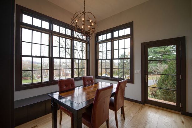
2. Benjamin Moore’s Bronzetone Trims are Darker Than Sherwin Williams’ Downing Sand Walls for an Elegant Traditional Living Room
Sure, darker trims and lighter walls look good together, but you know that you can make such pairings almost perfect?
By choosing the right colors to combine, you can create a combination of walls and trims that look almost godly. Just look at this living room if you want an example.
The walls in this living room are painted in Sherwin Williams’ Downing Sand. It’s a really appealing color. Then you see the trims and realize that the room is nigh perfect. The trims are colored in Benjamin Moore’s Bronzetone 60.
As you can see, the trims are very noticeable since they are way darker than the walls. The downing sand walls benefit from these trims since the trims become something like the frames of a painting canvas, a very bold one.
Just look at the combination of the two colors! Simply fabulous!
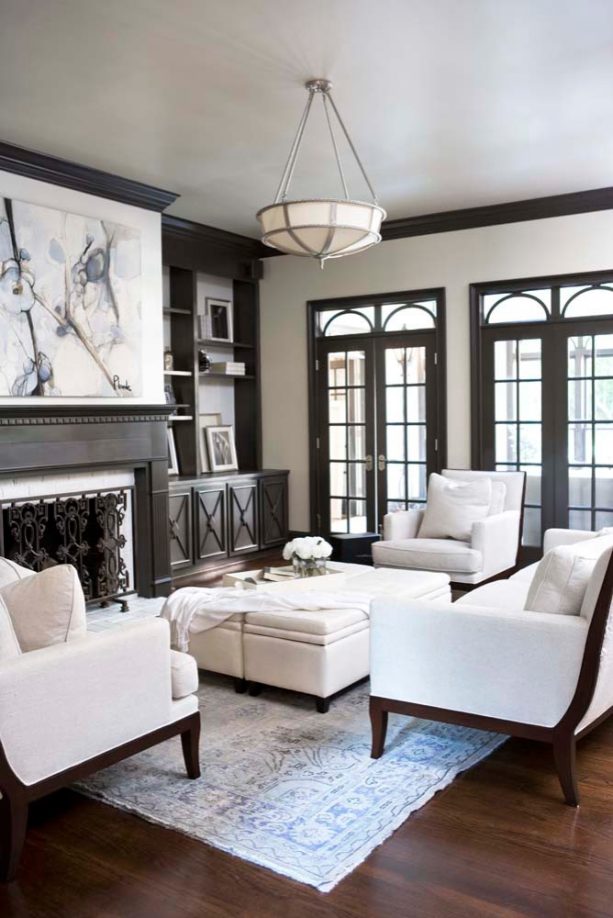
3. Benjamin Moore’s Black Trims are Darker Than Benjamin Moore’s White Walls for Creating a Beautiful Contrast
Are you interested in creating an eclectic living room that combines traditionality and modernity?
Then you should get some inspiration from this living room.
The room’s prominent black trims combine with the bright white walls to create a beautiful contrast. It’s a traditional combo, but it undeniably gives the space a pretty, modern look.
The room itself has a lot more things to offer, and they suit the walls and trims well.
For instance, the eclectic living room has ethnic and modern furnishings unified in scale and color. Incredible, isn’t it?
One of the most surprising things about the furnishings is that many of them were custom-made locally. The custom pieces include a sofa that seamlessly nestles into the chamber’s bay window.
Don’t forget the living room chairs, which are upholstered cozily in sheepskin.
Naturally, those handcrafted wooden benches are also ones to be enamored by. This elegant room with white walls and darker trims also have blown-glass sculptures, which look really vibrant in the room. They are made by Andy Paiko, a Portland artist.
All these cool things really help make the room with white walls and darker trims appear stunning.
If you want to try the colors used in this room, you can try Benjamin Moore’s black and white. The black is an absolute opposite of the white, and the two could create a charming blend of opposing colors. They really suit an eclectic room.
4. Painting Trims in Natural Wood Colors Darker Than Benjamin Moore Sepia Tan Walls
Do you have a wooden trim in your dining room?
If so, then you should consider keeping the properties of the material prominent.
Paint the trims in their natural wood colors. It’s okay if you want to use a color that’s a bit darker than the natural wood color. Just make sure the trims still look wooden.
This contemporary dining room has fabulous dark walnut stain trims that contrast the walls, being exponentially darker than them.
Brown is considered the color that adds warmth and depth to a space. It is perfect for a dining room, where family members would love to spend time and indulge themselves in a warm atmosphere.
The walls in this dining room are sepia tan, a color that contrasts the brown trim.
Sepia tan is a lot lighter than brown, and the contrasts really look fantastic. It is worth noting that the color helps create a feeling of familiarity, making it perfect for any space.
Naturally, it is perfect for this space, and it is the perfect opposite of the trims’ darker color.
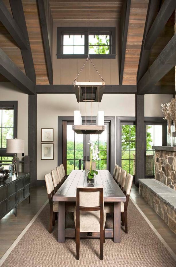
5. Benjamin Moore’s Ebony King Trims Darker Than Benjamin Moore’s Muslin Walls Makes for a Stunning Industrial Dining Room
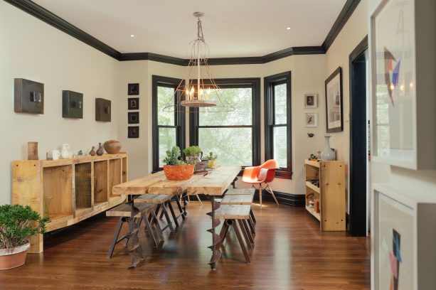
Do your plans involve remodeling an industrial dining room?
If so, you should consider painting your trims darker than your walls. It suits the industrial style, and more than that, it will make your dining room look cool. Just look at this house if you don’t believe it.
Surrounded by bright walls, this space looks so stunning, having a dark wood floor and all. The dark wood floor suits the mid-sized urban dining room really well.
The room’s bright walls are actually beige in color, and they are made to look really stunning by the dark trims on their lower edges.
Interested in trying the combination of darker trims and brighter walls shown in this dining room, you can try Benjamin Moore’s Muslin for the walls and Ebony King for the trims.
Muslin is not the brightest neutral color, and Ebony King is not the darkest color either. The two aren’t on the extreme sides of the color spectrum, and that’s why they suit each other so well.
6. Painting Trims in Benjamin Moore’s Espresso Bean to Make Them Darker Than Benjamin Moore’s Silver Satin Walls for a Classy Space
There are many ways to remodel a contemporary dining room into one that looks fresh. This dining room can give you some inspiration on that.
Just look at this beautiful dining room. The room looks so trendy with that medium tone wood floor, and a trendy look isn’t the only thing it boasts.
The room also offers a combination of light-colored walls and darker trims that are so captivating to the eyes.
The walls are painted in Silver Satin, and the trims are the representatives of wood. If you want to duplicate this dining room, you should consider painting your trims in espresso.
At a glance, the walls in this room look like shaker beige. However, it’s actually caused by the lighting since the actual color is much lighter than the one shown in the picture above.
To duplicate the looks of this room, you’d be wise to combine Benjamin Moore’s Silver Satin, this one is for the wall, and Espresso Bean. Espresso Bean trims are some of the best things you can pair with Silver Satin walls.
7. Benjamin Moore’s Iron Mountain Trims Darker Than Walls Bathed in Benjamin Moore’s Bavarian Cream Paint for a Luxurious Porch
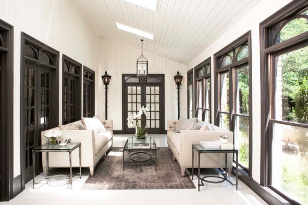
Trying to remodel a traditional porch?
If so, you should consider drawing some inspiration from this porch designed by Linda McDougald.
Linda is a prominent designer, and she has renovated her own home after effortlessly re-designing it. The house now looks so captivating, as you can see from the photo.
After the renovation, the house now showcases a unique mix of antique and contemporary furnishings.
The house also has screened-in side porch with a roof extension that boasts a classic look. Get some inspiration from the fabulous space, which sees a combo of white walls and trims that seem to be united with the doors. Simply fantastic!
If you want to copy the looks of the beautiful trims in this luxurious porch, you can try Benjamin Moore’s Iron Mountain. To copy the looks of the sleek walls, you can try Bavarian Cream.
Just look at how luxurious these two colors make this porch. Inspirational!
8. Painting Trims in Sherwin Williams – Duration Coating Black Darker Than Eastern White Cedar Shingles Walls in Victorian Style
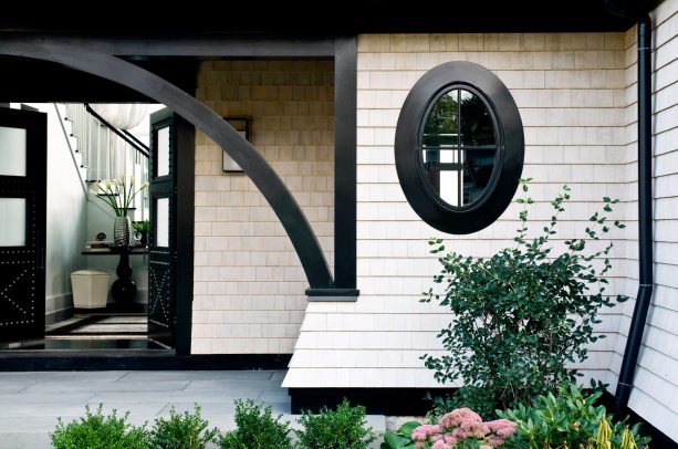
Remodeling a Victorian entry isn’t something that everyone can do.
The Victorian style is elegant and requires a lot of attention to detail. However, it’s not that you should lose all hope when you try to remodel your Victorian entry. Just look at this one, if you ever need some inspiration.
This Victorian entry welcomes you with simple yet effective running bond walls that are beautifully colored. The walls aren’t the only things that naturally welcome you to the house.
Accompanying the outer walls are double front doors made of dark wood.
The Victorian dark wood doors are there with black trims that suit the light-colored walls perfectly. They are such beautiful things to have at the front of a Victorian house. Elegantly stunning!
To mimic the colors of the outer walls, you can try Eastern White Cedar Shingles from Maibec. The color is lovely. To mimic the black trims you see in the picture above, you can try Sherwin Williams – Duration Coating Black. These two colors make a beautiful contrast and the suit an exterior incredibly well. Try them!
9. Benjamin Moore’s Night Shade Trims Darker Than Benjamin Moore’s Super White Walls for an Elegant Mediterranean Bedroom
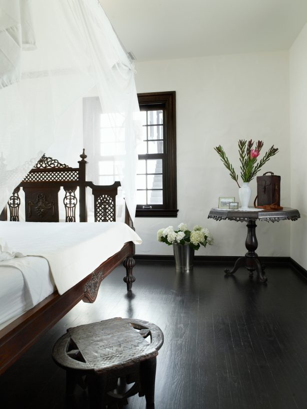
This elegant Mediterranean bedroom has a Tuscan dark wood floor and is the house of an antique bed that oozes luxury and class. The bed is caressed by elegant white cloth all the time, and the walls and trims mimic the relationship of the two.
The walls are painted in bright white, and the trims are colored in black. Not only does the combination of the two create a beautiful contrast, but it also makes the space look classy as well.
All of those flowers are just so helpful as they accentuate the room’s beauty in the best way possible.
To bring a beautiful and classy combination of colors like this one into your bedroom, you can try, for starters, painting your walls in Super White. Then paint your trims in Night Shade to match the walls.
Don’t forget to fill the room with beautiful things that ooze luxury and class. Some antiques would be lovely if you could manage to get a few for your bedroom.
10. Painting Trims in a Benjamin Moore’s Gray Shade Darker Than Benjamin Moore’s Briarwood Walls for a Marvelous Traditional Exterior
If you look closely, you’ll see a combination of walls in a lighter color and trims in a darker color on the exterior. The material on the exterior is stucco. The wall is painted beautifully using Benjamin Moore Briarwood.
How does it look on the mid-sized three-story house? Excellent, isn’t it?
The trims around the Briarwood walls just make it better.
If you’re intrigued to try the combination of the darker trims and the walls, you can try Benjamin Moore’s Gray for the trims.
11. Benjamin Moore’s Narragansett Green Trims Darker Than Cabot Semi Solid Deck Burnt Hickory Cedar Shingle on a Sleek Craftsman Exterior
The shingles on this house are stained Cabots Semi-Solid Deck and Siding Oil Stain, 7406. The color is Burnt Hickory. Speaking of the house’s exterior, of course, you must not avert your eyes from those bright walls.
Then let’s move on to the trims, which look perfect alongside the walls. The trims on this exterior are colored in Benjamin Moore Aura Exterior Low Luster Narraganset Green HC-157.
For your information, it is actually dark blue. When put side by side with Burnt Hickory, the color sure looks sharp, and the two create a really captivating appearance, as evident from the picture. Amazing!
12. Paint Your Trims in Benjamin Moore’s Black to Make Them Totally Darker Than Dulux ICI Natural White Walls for a Modern Space
This space looks modern, and it did not get its modern look from nothing. It’s the product of careful decisions on the choices of colors to use in the room.
The living and dining rooms used to be separated before the house’s renovation. Now they share everything, including a wood floor and the state of not having a tv or a fireplace in it. They also share the modern combination of walls and trims, which you can see in the picture.
Try to duplicate the sleek and modern look of the walls and trims at your house if you’re a fan of anything that looks modern.
For the walls, you can try Dulux ICI Natural White. For the trims, you can try Benjamin Moore’s Black.
Sometimes, going simple is the best way when a modern look is a final objective.
Closing
Darker trims are undeniably the best for light-colored walls.
First of all, the contrast of the opposing colors is delightful on the eyes.
What’s more? Trims need to be visible because you have gone the extra mile to build them.
Don’t just paint them in the same colors as your wall. You’d better make them stand out by giving them darker colors than your walls.
Naturally, there are various ways to combine darker trims and brighter walls. The color combinations shown earlier sure have made it obvious.
Which combinations did you like the most? Whichever it is, we hope that you got a lot of inspiration from the designs we’ve presented in this post.